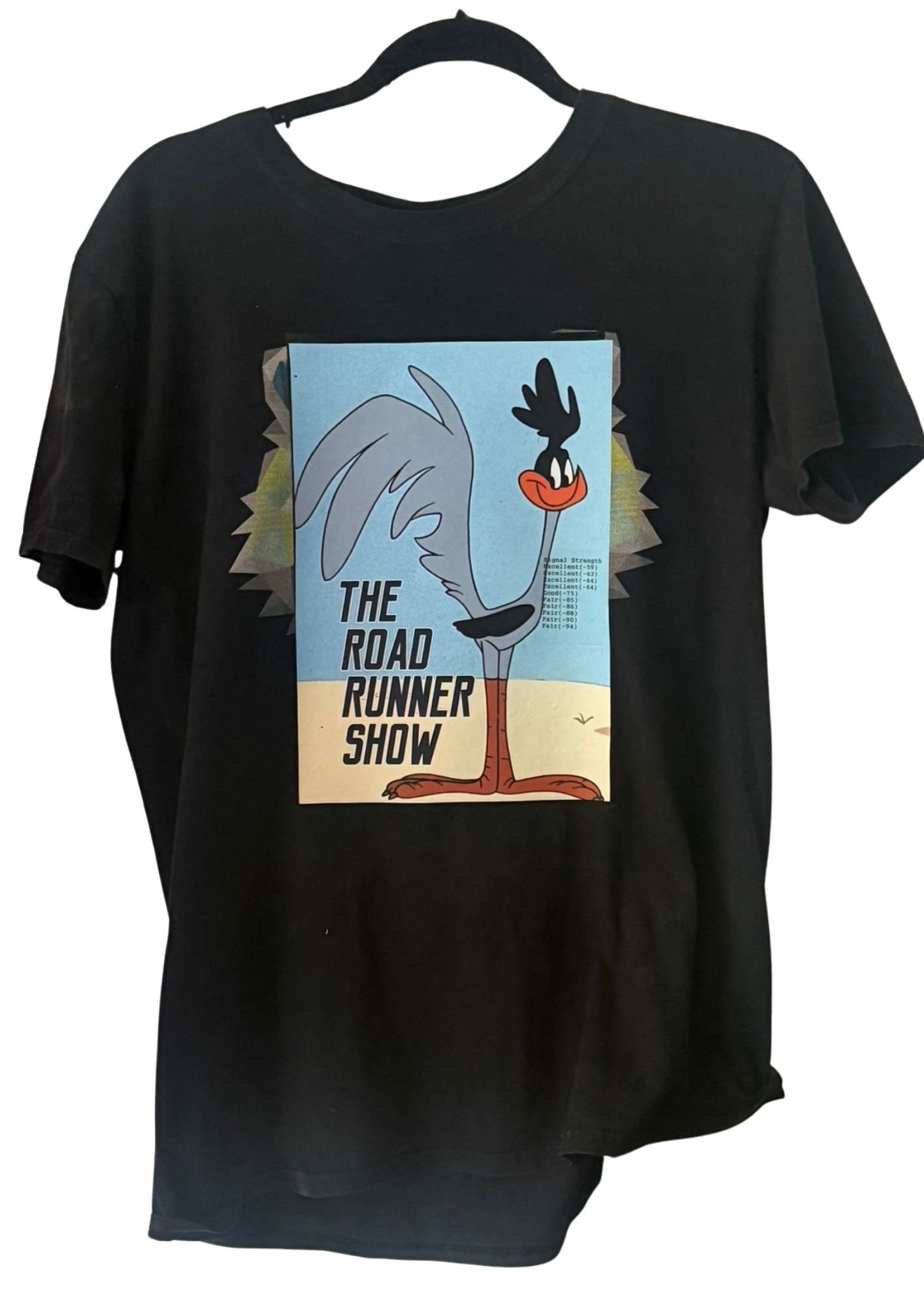
 Limited run
Tee
Road Runner Black Tee
£38
Poster-style print on a clean black base.
Sizes: S / M / L / XL
Season 01
Graphic-led pieces in small-batch runs.
Limited run
Tee
£38
Poster-style print on a clean black base.
Sizes: S / M / L / XL
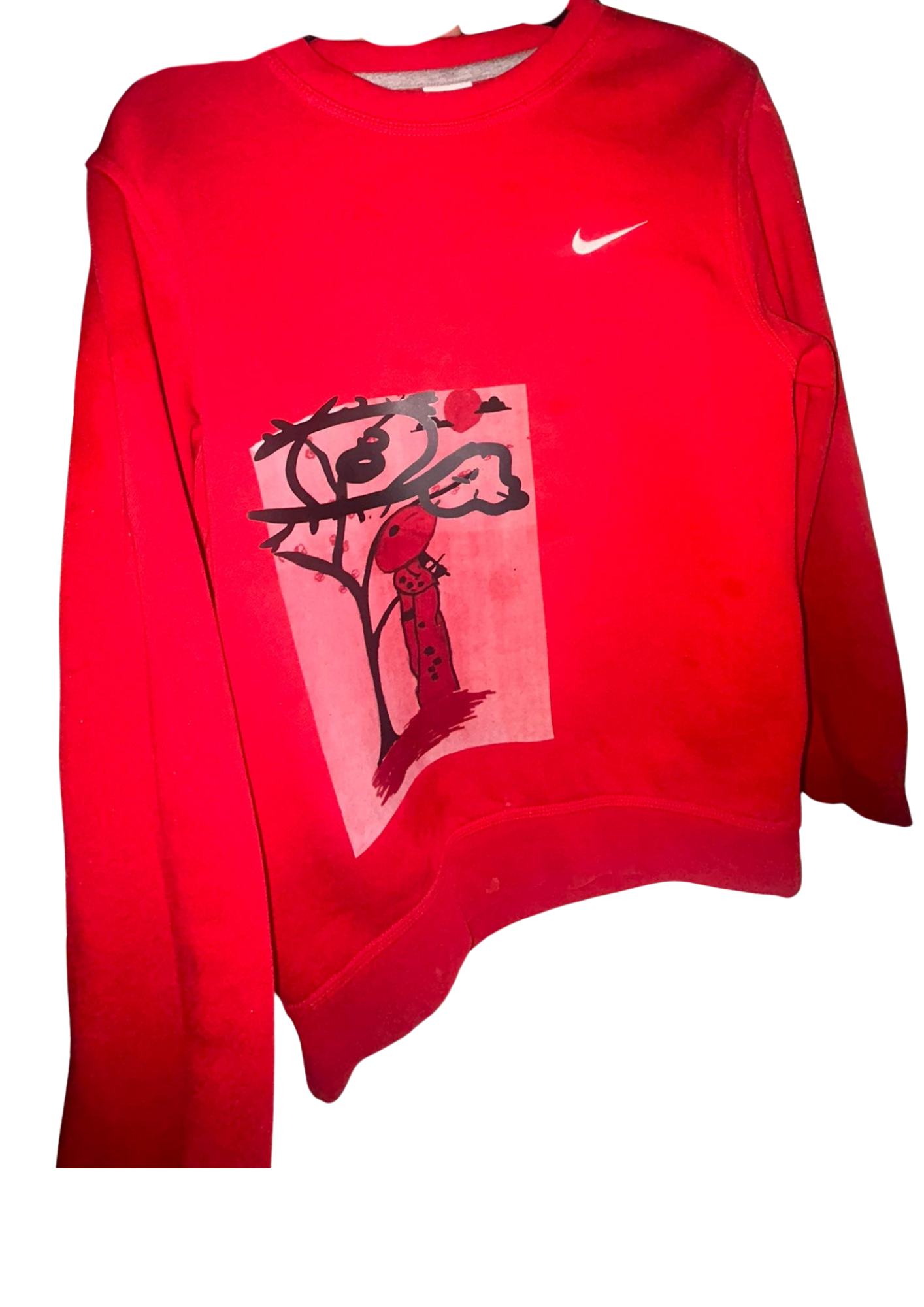
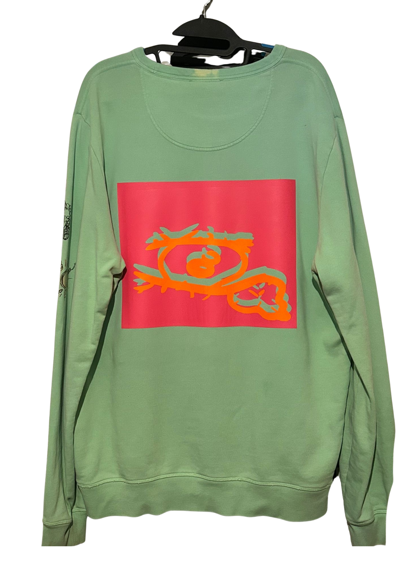 Limited run
Crewneck
£56
Faded green crewneck with printed front graphic.
Sizes: S / M / L / XL
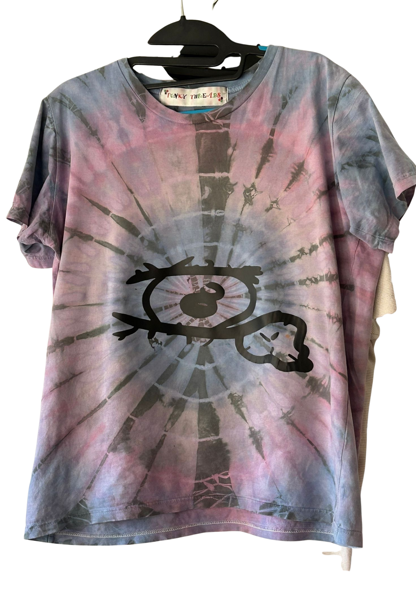 Coming soon
Tee
£38
Tie-dye haze and a large eye mark.
Sizes: S / M / L / XL
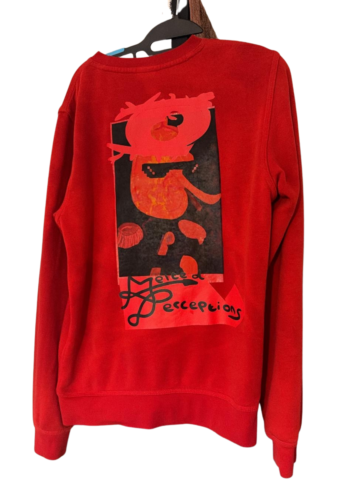 Limited run
Crewneck
£56
Richer red layer with a darker central print.
Sizes: S / M / L / XL
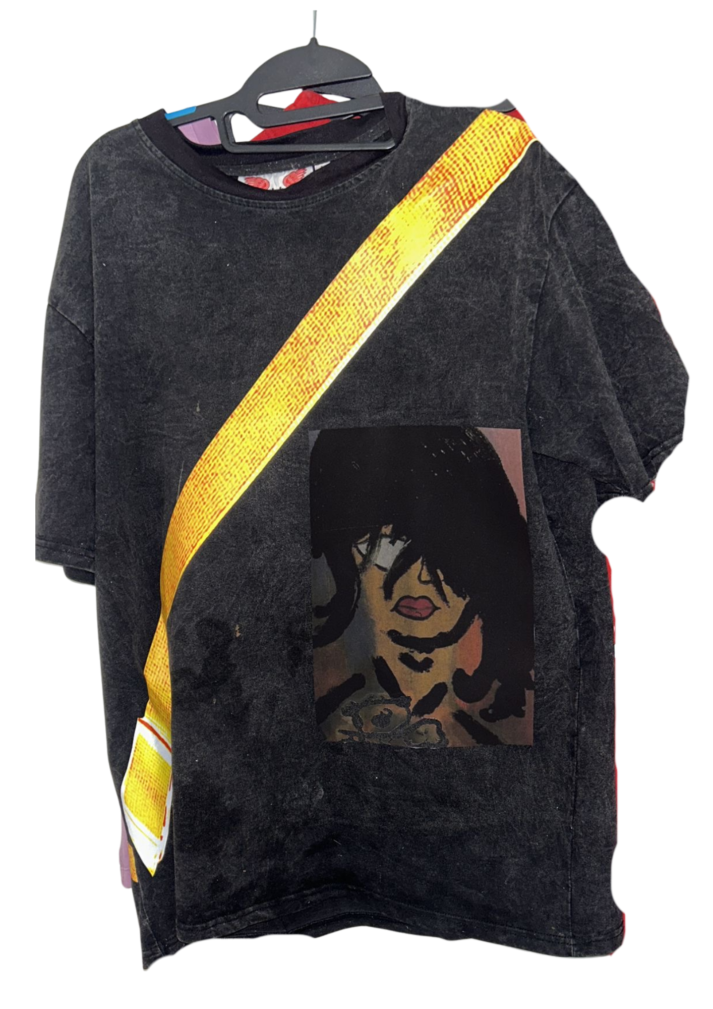 Drop preview
Tee
£38
Dark washed tee with diagonal signal graphic.
Sizes: S / M / L / XL
 Coming soon
Sweatshirt
£56
Bright field balanced by a hand-drawn graphic story.
Sizes: S / M / L / XL
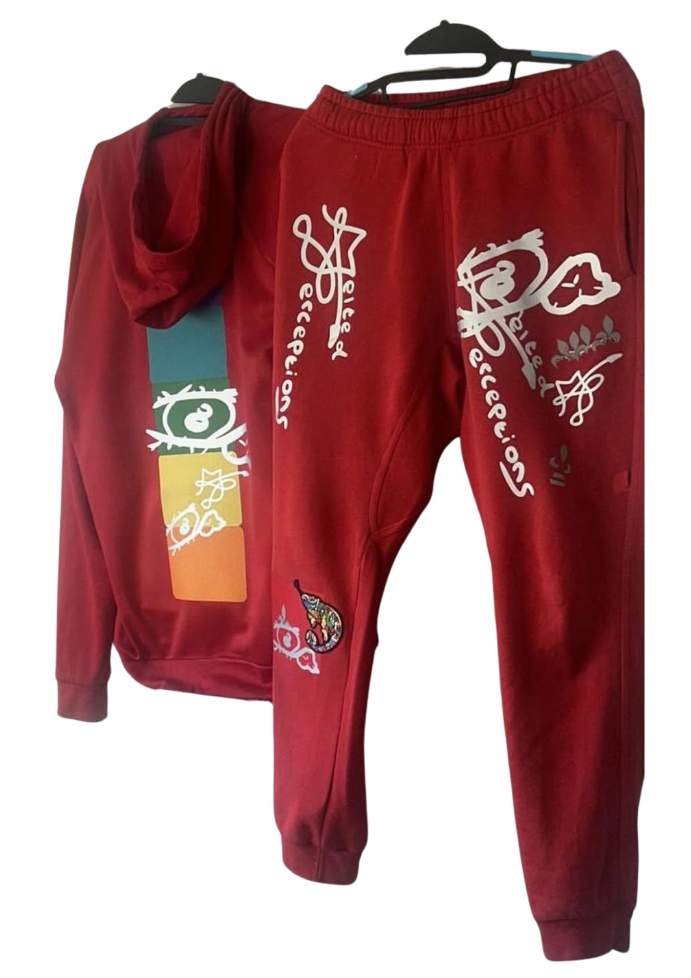
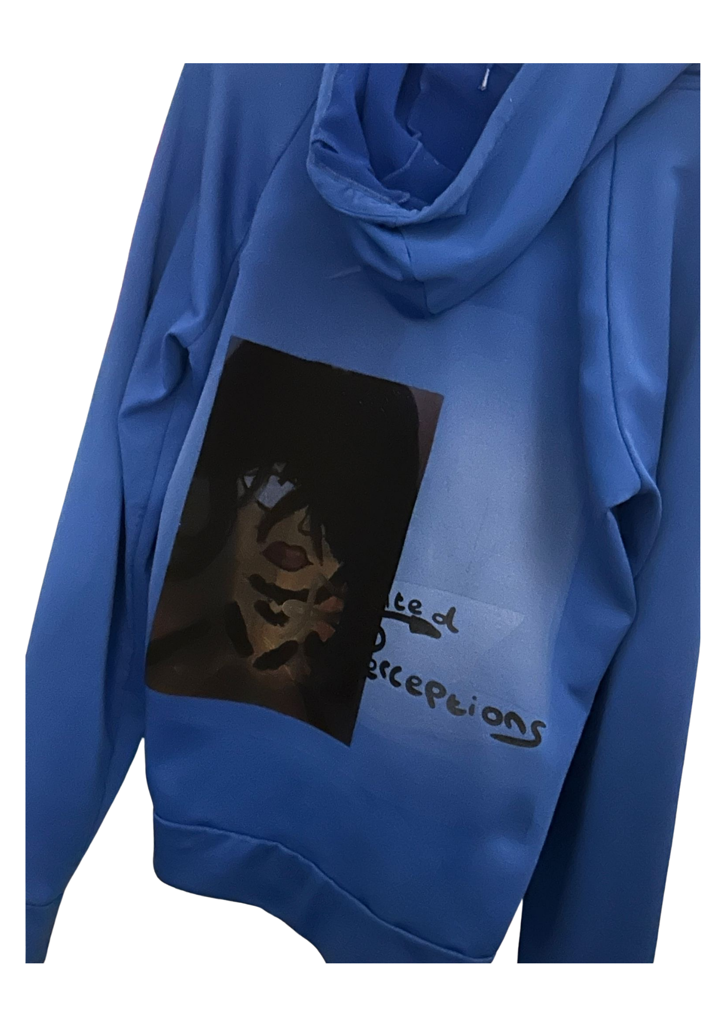 Limited run
Hoodie
£62
Cool-toned hoodie for the collection's low-light mood.
Sizes: S / M / L / XL
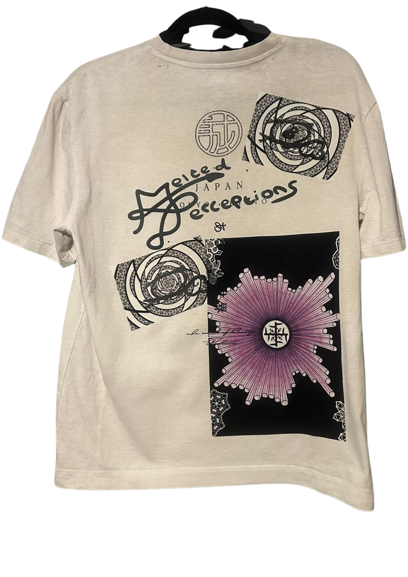 Coming soon
Tee
£38
Soft cream base for cleaner graphic placement.
Sizes: S / M / L / XL
Shop categories